Tapestry Making & Designing
1989-98
by Christopher Long
I
have enjoyed designing and making simple tapestries for several years, not least because the ingredients are very light – canvas, wool and needles – and I can pull them out of my pocket and occupy myself under almost any conditions. This was particularly useful in 1991/92 when I was working abroad, although lack of good light was often a problem.
This tends to raise eyebrows (waiting at an airport, for example) but can lead to interesting encounters such as with village women in the world's more remote regions. My creations are not sophisticated and require very little skill or talent. Nearly all of them have been turned into cushion covers or book-bags. I recommend this activity to anyone whose life involves irritating periods of 'hanging around' and 'waiting'. Interestingly I have found several fellow practitioners among actors on film sets and in the parliamentary debating chamber of the British House of Lords. But I've never met a fellow hack or scribe stitching away as I sometimes do.
On a technical note, I find that computer graphics are ideal for tapestry design. At a resolution of 800 per cent I can make adjustments stitch-by-stitch – each pixel equalling one stitch. At 400 per cent one can see the effect it will produce 'in reality'. The illustrations below are reduced from their full size (800 per cent) to 100 per cent. Remember too that most graphics programmes allow one to select any elements which match a particular colour and replace them with a new colour. This makes experimentation at the design stage very easy.
To see these images at '1 pixel=1 stitch', click on the image and then expand the new image to the maximum
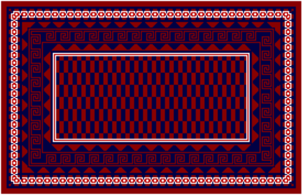
This is the first tapestry I designed and made. It measures approx. 18 inches x 30 inches (tent stitch). Combining the rich, subdued colours (purple and deep blue) behind the strong primary foreground was rather risky. Nevertheless I liked the background effects enough to do variations on this theme on several more canvases. The finished item was, needless to say, riddled with small errors as I learnt from my mistakes (one lesson being that small errors can enhance the result!).
This is the second tapestry I both designed and made, again approx. 18 inches x 30 inches (tent stitch). I continued with the same purple and deep blue I had used in the first (above). This was remarkably simple to make though I quickly learnt that with symmetrical, geometric designs of this sort it is essential to decide, before starting, whether to have an odd or even number of stitches vertically and horizontally. This dictates whether and how the symmetry will work.
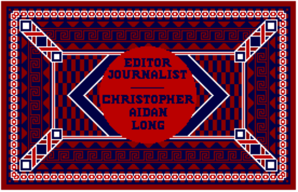
This is a sort of joke. I had problems at my office with visiting contributors who often forgot the name of the person they were visiting and then proceeded to sit in my chair. Being somewhat territorial by nature I adapted the design above to include a large 'name stamp'. As a design it doesn't work – but it solved my office problems perfectly! It's exactly the same size as the one above, about 18 inches x 30 inches, in tent stitch. I should have given more thought to the effect I wanted.
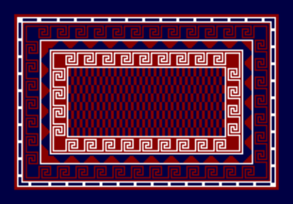
This, the fourth tapestry I designed, measures approx. 14 x 20 inches (tent stitch). Using the same subdued purple and deep blue colours as a background, I intended to create a sort frame on which to apply a fore ground design – see next picture. The effect of the purple sitting so closely to so much white didn't work. Purple becomes a brighter 'red' alongside so much white!
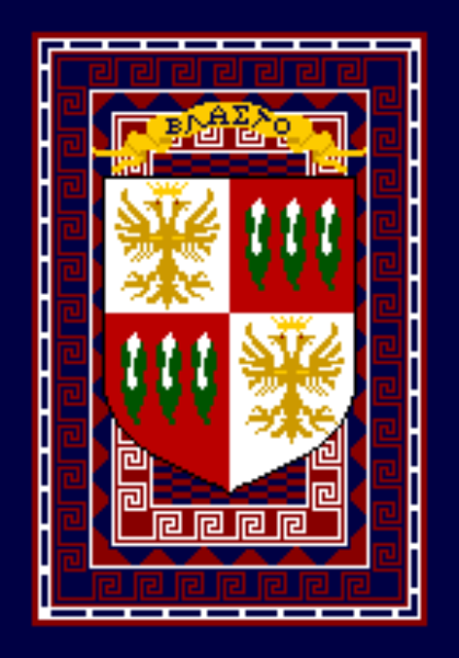
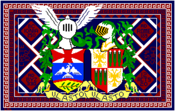
As mentioned above, the background design was intended to carry a foreground design – which works in a way except that the postioning of the emblem is thrown out by the gold banner at the top and the overall effect is spoilt by the bright inner purple-and-white Greek key pattern. The power of opposing colours (green and red) contrasts well however with the 'composed' purple and deep blue backgrounds.
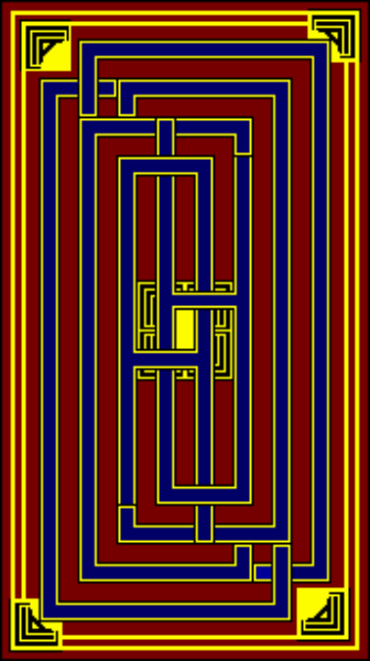
This tapestry is now completed at about 18 inches x 30 inches – i.e. I reduced its length a little from the design shown here. It's made in plain tent stitch as an experiment which was influenced by some early Chinese and Art Deco decoration I admired and is based on monograms of my initials: CAL.
These are some designs I am now playing around with. The colours in the GIF image (left) are wildly inaccurate but the intention is simply to explore the effects of colour combinations – a typical art school exercise. However, in this case, I'm using the standard red, green and blue (RGB) of computer imaging and, within the limits of the wool shades available, experimenting with balance and hue.
